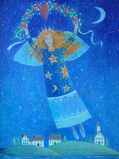
 This original acrylic painting was created with multiple layers of transparent color mixed with matte medium. I used Liquitex brand acrylics and medium. I usually start with my backgrounds creating layers of different colors. I am partial to pthalo blue, pthalo green and dioxizene purple. These are very intense colors. You only need to use a small amount of pigment when you mix them with medium. I dip my brush into water first, but I don't mix my paints with water. I only use medium. It makes the colors so much richer and the pigment doesn't break up as it can when too much water is used.
To get blended colors as in the transition of the sky from dark at the top to light below, I work quickly and don't use retarding medium, while blending with a fan shaped brush. I start at the top with a greater amount of the dark paint gradually adding more medium as I proceed down the canvas. When this layer is dry, I go over the area again using medium with a little titanium white. I work fast and lightly adding this lightened mixture to areas of the background moving again down the canvas from about 1/4 of the way from the top to the bottom of the sky area. You can experiment until you get the result you want using varying amounts of medium, white and blue pigment, blending with the fan brush quickly before it dries, and going back into different areas you want to darken or lighten.
I like to add dioxazene purple to the top of the painting to create a very dark sky, so that it looks like I'm looking far out into the universe. Stars really pop against the dark sky and that can look very dramatic.
With a design this detailed I start with a drawing on paper and either transfer it to the canvas, or redraw onto the canvas. A good drawing tool to use is a watercolor pencil in a contrasting color, because if you want to erase, just use a damp paper towel. Another method I like to use is to draw on good paper, cut the image out carefully and adhere it to the canvas with matte medium. Completely coat the back of the paper, press into place and with a large brush, paint medium over the top of the cutout. Let dry and you have a great surface on which to paint your main subject. This can be done with other objects in the painting as well.
All the light blue areas shown are mixed from the same colors as the background with some more white added. When you add white to a mixture with matte medium, the more you add, the more opaque it becomes. This is a good approach for foreground areas.
I always use very few colors in my paintings. I keep a limited pallette, mixing colors instead to get what I need. This way, all colors in the painting are compatable.
For the detail areas in the angel, I used a muted orange, which pops because it is the complementary color of the blue. So my colors don't appear garrish, I mix them with small amounts of their compliments to tone them down.
The last step in the painting is adding all the stars and hearts to give the painting a magical quality.
This painting has been my most popular work. 8 x 10 inch prints are available at my Etsy store for $18.00 should you wish to purchase one. Click on one of the links to the right and at top of my blog.
Happy Painting!


.jpg)


 Polyclay Pins, great for a jacket, coat, handbag, bulky sweater...
 A very lightweight pendant with handstamped original designs, colored inks, charms.... all held together with copper wire, and hung from a soft glass cord. Handmade copper clasp.


